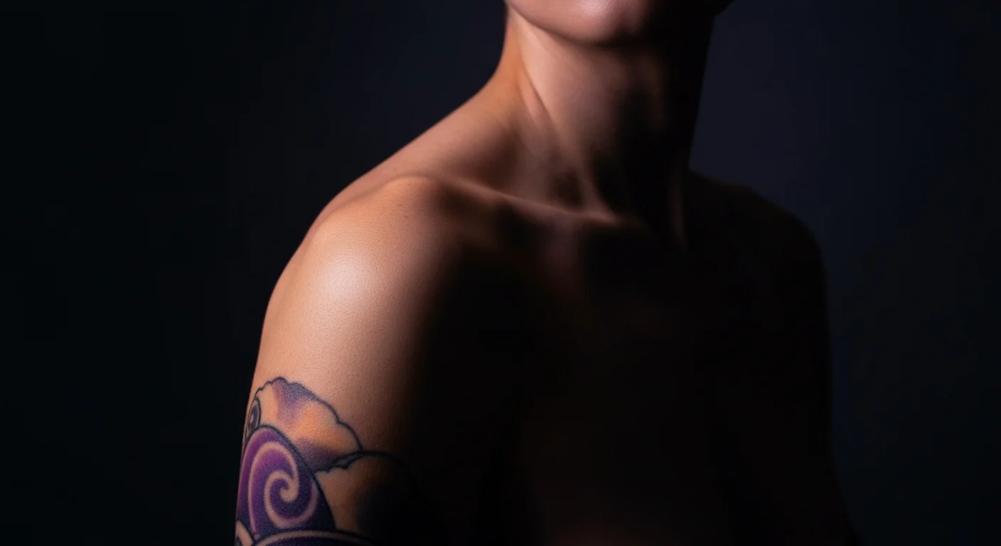
You’ve picked the design. You’ve saved a hundred references. You know you want it.
Then comes the question that stops everything: where?
You pull up your phone, hold a printed reference against your forearm, twist to look at your shoulder in the mirror. Nothing gives you a real answer. The stakes feel higher than people warned you. Because here’s what most placement guides skip: where you put a tattoo has more impact on whether you’ll love it long-term than almost anything else about it. The wrong placement doesn’t just make a tattoo inconvenient. It’s one of the top reasons people end up wanting it gone.
The short answer on placement: choose based on four things — visibility to you and others, how the design fits the body’s contour, how that location ages, and your pain tolerance. Get all four right and placement stops being a source of anxiety and becomes a decision you’re confident in.
Placement Regret Is More Common Than You Think
Nearly half of all tattoo regret — around 41% — traces back to placement dissatisfaction, not design choice. (For a full breakdown of why tattoo regret happens, the pattern holds: it’s almost always a preventable decision, not an unavoidable one.) That’s not a small number. You can love a design and still wish you’d put it somewhere else. The arm is the most regretted placement overall, which makes sense: it’s also the most common. But the interesting data is at the extremes — face, neck, and hand tattoos carry 2x the regret odds compared to more average placements. Hips and feet, by contrast, sit at the bottom of the regret pile.
Worth noting: a 2024 AARP survey of 3,076 adults found 75% of tattooed Americans are completely satisfied with their tattoos. The gap between that number and the regret rate tells you something — most regret is specific and localized, not “I wish I’d never started.”
The pattern is clear: high-visibility placements feel exciting in the moment and complicated over time. Low-visibility placements tend to stay personal and intentional.
That doesn’t mean you should avoid visible spots. It means you should go in with clear eyes about the tradeoffs.
High-Visibility Placements Come With a Tradeoff
Hands, neck, and face are called “job stoppers” for a reason. They’re permanent social signals — visible in every professional setting, every family dinner, every first impression. That’s not a dealbreaker, but it’s a real factor that people underestimate at 22 and understand at 32. YouGov data shows 26% of employers are less likely to hire someone with visible tattoos — a number that hasn’t moved much despite tattoos becoming more culturally accepted overall.
Hands and fingers: The skin moves constantly, the sun hits them directly, and hands are the first thing people notice when you reach for anything. Finger tattoos in particular are notorious for fading and requiring touch-ups within a year or two. They look incredible right after the session. They look like blurry suggestions two years later.
Wrists and inner forearm: High visibility, always. You’ll see it every time you check the time, type at a keyboard, or pour coffee. Some people love that — constant reminder of something meaningful. Others find it overwhelming once the novelty fades. The inner wrist in particular is personal-facing, which can feel intimate and grounding rather than performative.
Neck and behind-the-ear: Elegant in photos, permanent in reality. These placements read immediately as committed — people who see them rarely forget them. If that’s the intention, great. If you chose it because it photographed well, that’s worth sitting with.
Outer forearm and upper arm: The sweet spot for most people. Visible when you want it visible (short sleeves), coverable when context calls for it (long sleeves). Enough flat, stable surface area to support most design sizes. And one of the cleaner healing experiences. This is the placement that shows up everywhere because it earns it. If you’re deciding between inner and outer forearm specifically, that choice has more downstream effects than most people realize — visibility, aging, and design type all point in different directions.
Your Body’s Contour Changes How the Design Reads
A flat design placed on a curved surface wraps. That sounds obvious, but it surprises people constantly.
Hold a piece of paper flat and look at the design. Now curve it around your wrist. Letters compress. Symmetrical shapes tilt. Geometric lines that were perfectly parallel start to converge. This isn’t a mistake — it’s physics. The question is whether your design accounts for it.
Where contour creates problems: small text on the wrist (curves and compresses), symmetrical geometric designs on the shoulder (the curve of the deltoid distorts the midline), anything that relies on being read flat placed across a rounded surface.
Where contour becomes an advantage: designs that are made to wrap — bands, florals, vines, mandalas — can look extraordinary on curved surfaces because the shape follows the body’s natural form. A botanical design that wraps around the upper arm reads completely differently than the same design pinned flat, and usually better.
What to ask your artist: “Does this design need to be modified for this placement?” A good artist will either adjust the design or recommend a placement that suits it better. If they say it’s fine without looking closely at the reference and the placement together, that’s worth a second opinion.
Certain Spots Age Faster Than Others
Every tattoo fades over time. But some placements fade faster — much faster — depending on sun exposure, friction, skin movement, and how the skin itself ages in that area.
The fast-faders:
- Fingers and hands: Constant movement, constant sun, constant friction against surfaces. Even bold blackwork here requires more maintenance than anywhere else on the body.
- Feet and toes: Similar story. The skin on the bottom of the foot isn’t even recommended by most artists because it gets rubbed away with every step. The top of the foot fades fast too.
- Inner elbow and back of knee: Flexion zones. Skin that bends thousands of times a day breaks down ink faster than skin that mostly stays still.
- Chest (décolletage): High sun exposure in summer without the social cue to apply sunscreen. Sun is a significant factor — a 2020 study in Photodermatology, Photoimmunology & Photomedicine found UV radiation directly accelerates fading in colored tattoos, independent of ink quality or technique.
The slow-faders:
- Upper back and shoulder blades: Less sun, minimal friction, doesn’t move much. Bold designs here hold detail for decades.
- Upper arm (outer): Good aging properties. Enough protection from constant UV, but not so hidden that you never apply sunscreen.
- Hips and thighs: Lower sun exposure, relatively stable skin. Also the least regretted placements in most research.
The style of your design matters here too. Fine line work on a fast-fading spot is asking for early blurring. If you love fine line and want a high-movement placement, your artist can compensate with slightly thicker lines than you think you want — they’ll read thin once healed and hold up much better at year 3. Styles like cybersigilism — which rely on ultra-fine linework and geometric precision — are especially sensitive to this: they need flat, stable surfaces to execute correctly and to hold that precision over time.
Pain Is Real But Rarely the Deciding Factor
Pain scales for tattoos are genuinely useful context, but they get overweighted in placement decisions. A few honest points:
The most painful spots — ribs, sternum, spine, shins, feet, elbows — are legitimately more intense. Not unbearable for most people, but you’ll notice the difference from a fleshy upper arm session. Research on tattoo pain perception confirms body location is the dominant driver of pain intensity — more so than session duration, individual pain tolerance, or gender. The pain is also temporary. A four-hour rib piece ends. The tattoo is there for forty years.
Where pain actually matters: if you’re getting a very large tattoo in a painful location, session length becomes a real factor. Twelve hours on your ribs requires a different mindset than four hours on your calf. If you know you have a low pain tolerance, building that session into multiple shorter ones is a legitimate option worth discussing with your artist.
The placements most people report as unexpectedly tolerable: sternum (painful but manageable with breathing), outer ribs (worse the closer to the spine), inner arm (mild, despite its reputation).
The ones that deliver what they promise: elbow ditch, shin, kneecap, ribs nearest the spine. These hurt. Plan accordingly. For a tier-by-tier breakdown of every major placement, see the full tattoo pain ranking.
Test Your Placement Before You Commit
The closest thing to certainty before a tattoo is seeing the design in the actual spot on your actual body. Not on a reference photo. Not photoshopped onto a model who shares roughly your skin tone. On you.
This is exactly what TattThat is built for. Upload a photo of the placement you’re considering — forearm, shoulder, wrist, wherever — choose or upload a design, and place it using the drag-and-resize tools. You can see immediately whether the size is right, whether the orientation works with your body’s contour, and whether that placement actually feels like you once it’s sitting there.
Most people who use it change something. Size, usually — designs that look right at reference scale often read too small once you see them on your skin. If you’re still working out the right size for a given placement and design type, the tattoo size guide covers the specific rules by canvas and complexity. Sometimes placement shifts entirely: what felt right on the wrist makes more sense on the forearm once you see both. That’s not wasted time. That’s the decision being made with real information instead of guesswork.
Two free previews, no card required. Worth using before you walk into a shop with a plan you’ve only seen on paper.

Placement Cheat Sheet
If this is your first tattoo and you’re still deciding between these options, the first tattoo placement guide breaks down exactly which spots work best when you’re just starting out — and which high-risk placements to save for later.
Outer forearm: Flat surface, visible but coverable, good aging, moderate pain. The default choice for a reason.
Upper arm: Similar to outer forearm but slightly more coverable. Great for larger designs.
Calf: Underrated. Ample space, relatively low pain, not overexposed. Good for detailed work.
Upper back / shoulder blades: Best aging properties of any placement. Less immediate visibility to you.
Wrists: Intimate and personal-facing. Age faster than the forearm. Check pain tolerance.
Ribs: Dramatic placement, harder session. Fades slower if kept out of sun. Along with the hip and upper back, one of the best hidden placements for when work can’t know.
Feet and fingers: Trendy, high-maintenance, known faders. Go in knowing you’ll likely need touch-ups.
Neck and hands: High commitment. High regret potential. Worth the most deliberate decision-making.
The right placement is the one that fits the design, fits your body, and fits the life you’re actually living. Once you have it locked, the other signs of readiness tend to fall into place. — not the one that looks best in a flat reference photo or performed best for someone else’s skin.
Take the time to see it on yours first.
See It on Your Skin Before You Commit
Upload a photo, pick a design, and see exactly how it'll look — in seconds. 2 free previews, no card required.
Try TattThat Free →