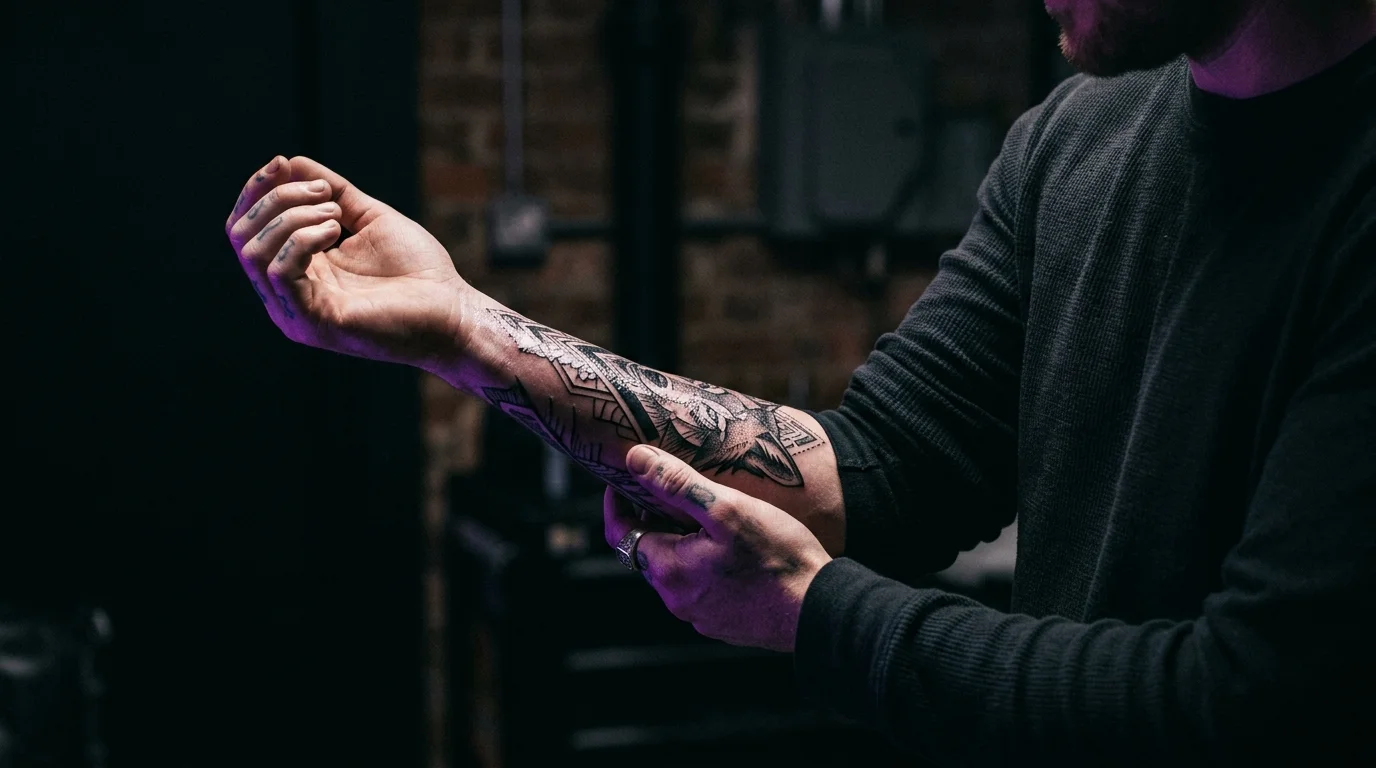
Picture yourself five years from now, sleeve rolled up at a summer gathering. Someone asks to see your tattoo. You roll it up — and there it is, just as you imagined it. Sharp. Intentional. Exactly the right size for that spot on your arm. You’re glad you didn’t rush it.
Now run the other version. Same moment, different outcome. The design that looked perfect in a 1-inch thumbnail has spent five years migrating in your skin. The fine lines have merged. The detail is gone. What was once a delicate botanical piece is now a green-gray suggestion of something that used to mean something.
The choice between those two futures happens before your appointment. Specifically, in the sizing conversation you have with yourself — or don’t.
The direct answer: tattoo size is determined by three things — the canvas your placement offers, the complexity of your design, and how you want it to age. Get all three aligned and size stops being a guess and starts being a decision you’re confident about.
Small Tattoos Look Perfect on Instagram — and Blurred After Five Years
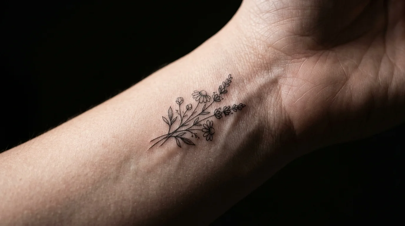
The “tiny tattoo” aesthetic is real and compelling. Single-needle script on the inner wrist. A small moon behind the ear. A fine-line floral that fits in a two-inch square on the forearm. They photograph beautifully, they feel subtle and personal, and they’ve dominated tattoo trends for years.
The problem isn’t the aesthetic. The problem is what happens when you put hairline-thin lines into skin over time.
Ink doesn’t stay exactly where it lands. Your body treats tattoo pigment as a foreign substance — macrophages attempt to break it down and carry it away, skin cells turn over, and UV exposure works on the pigment continuously. For bold designs with heavy saturation, this process shows up as gradual softening over decades. For fine line work with minimal ink density, even minor spreading causes thin lines to appear fuzzy or noticeably thicker relatively quickly.
Vatican Tattoo Studio in Delray Beach describes the typical fine line timeline this way: still crisp in years 1–3, edges becoming slightly fuzzy around year 5, visible line thickening by year 10, with fine details eventually blurring into a shadow of the original. That’s not a failure of the art — it’s just what happens when hairline strokes meet skin biology over time.
The fix isn’t to avoid fine line work. It’s to give fine line work enough room that the spreading still looks intentional. A fine-line floral that’s well-spaced at 4 inches reads beautifully for years longer than the same design crammed into 1.5. The elements have buffer. When lines thicken slightly, they still read as lines — not as a merged smear.
UV light accelerates the process. Sun-exposed placements (forearms, wrists, ankles, décolletage) age faster than covered ones. SPF on tattoos isn’t optional maintenance — it’s the difference between a design that holds for a decade and one that needs touching up at year three.
The most common sizing mistake isn’t going too large. It’s going too small for the design’s complexity.
Size Rules by Placement
The right size for any tattoo starts with the surface you’re putting it on. Different placements offer different constraints — and ignoring those constraints is how you end up with a design that looks fine on paper and wrong on your skin.
Wrist and inner wrist: The canvas is small and curves significantly. Designs here should typically stay under 2–3 inches and use simple, single-element compositions. The curvature means anything meant to read as “straight” on a flat reference will arc when it wraps around the wrist. Text needs to be large enough to remain legible after some natural spreading — small script at the wrist ages faster than almost anywhere else on the body.
Forearm (inner and outer): The best natural canvas for most designs. You have 6–8 inches of relatively flat, stable surface, and the skin ages well here. Most mid-size designs — 3 to 5 inches — sit here naturally. The forearm placement guide covers the inner-versus-outer tradeoff in detail; for sizing, the inner forearm is slightly narrower, which limits design width, while the outer forearm handles symmetrical designs better.
Shoulder and upper arm: Natural muscle curvature means the effective “flat” reading area is smaller than the arm looks. Designs centered on the outer shoulder read well from a direct angle but may distort on the sides. Medium to large designs (4–8 inches) suit this placement well. Smaller designs on the shoulder can look lost against the mass of the canvas — this is one spot where going a size larger than you think reads better, not worse.
Ankle and foot: Small, curved canvases with known fading challenges. As covered in the foot tattoo placement guide, foot placements age faster than almost anywhere else — which makes the argument for bold, simple designs even stronger here. Fine-line detail at ankle scale tends to blur within a few years. Clean single elements hold better.
Back, ribs, thigh, and calf: Larger canvases where the common mistake is going too small. A 3-inch design placed in the center of the upper back looks like a postage stamp. Designs intended for large canvases should scale to fill the space — or be placed near an edge where the negative space is intentional, not accidental.
Your Design’s Complexity Sets the Minimum Size
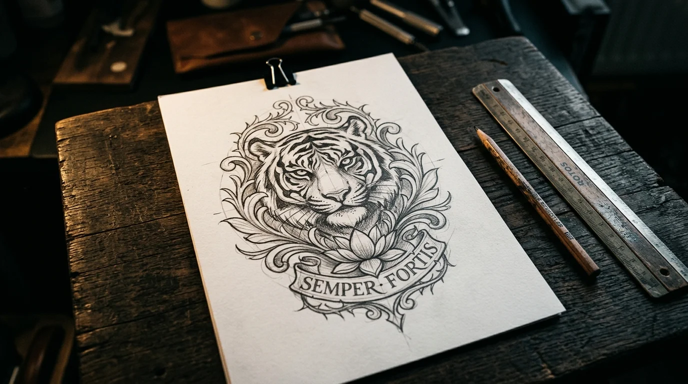
Every element in your design needs enough space to age without merging with its neighbors. This is the rule that most clients hear from artists right before the artist suggests going larger — and the rule most clients initially resist.
Single-line or silhouette designs have the most flexibility. A clean outline without interior detail can work small — down to 1 inch for very simple shapes — because there’s no interior spacing to lose. Simple geometric shapes, minimal animal silhouettes, clean script in bold fonts. The line can spread slightly and the design still reads.
Fine line florals and botanicals need room. The petals, stems, and negative space between elements all need buffer so that natural ink migration doesn’t merge them together. Most experienced fine line artists recommend at least 3 inches for anything with interior detail. Push below that and you’re asking the design to hold complexity it doesn’t have space for.
Portraits and faces require the most space of any style. A photorealistic face needs enough room to hold the distance between the eyes, the gradient of the shading, the definition between light and shadow. Most portrait artists push back on small requests not because they can’t technically execute the lines, but because they know what it’ll look like at year five. Four inches across is generally where a portrait has room to age gracefully — below that, the features tend to merge over time.
Script and lettering is the most size-specific design type. Vatican Tattoo Studio recommends against script under roughly 3–4mm cap height — below that, even minor line spread causes letters to close in on themselves and lose legibility. Bold fonts can go slightly smaller; hairline fonts need more room. The longer the phrase, the more important it is to size each letter appropriately rather than shrinking everything to fit a small space.
Traditional and blackwork styles are the most size-tolerant. The bold outlines and solid fills hold up at smaller scales because there are no fine details to lose — the aesthetic is built around thick, durable marks. A bold traditional rose at 2 inches will read clearly years longer than the equivalent fine-line version at the same size. If you’re drawn to fine line aesthetics but worried about longevity, going slightly larger than you initially planned is the most practical hedge.
The good news: fine line tattoos done well by a specialist, placed thoughtfully, and cared for consistently can still look sharp after a decade. The variables that matter most are artist technique, placement, sun protection, and giving the design enough space to breathe. Size is the one you control entirely before the appointment.
Test Your Size Before You’re in the Chair
The gap between “I think this size will work” and “I know this size is right” is smaller than most people realize — if you take one extra step before booking.
Print your design at actual scale. Place it on your skin. Look at it in natural light, from the angles other people will see it. Hold it there for a few minutes. Does it feel right? Does it look intentional or lost on that canvas?
Better yet, use TattThat to see your design at actual scale on your actual skin. Upload a photo of the placement you’re considering, load your design, and drag it to the exact size you’re thinking. You’ll immediately see whether a 3-inch piece looks intentional or lost on your forearm — whether that script reads clearly at the scale you’re imagining, or whether you need to go a size up. The tattoo placement guide makes the point well: most people who preview digitally change something, and it’s usually the size. Not because the original idea was wrong — because seeing it at real scale on real skin reveals what a flat reference photo can’t.
Two free previews, no card required. It’s worth using before you walk in with a plan you’ve only seen on paper.
See It on Your Skin Before You Commit
Upload a photo, pick a design, and see exactly how it'll look — in seconds. 2 free previews, no card required.
Try TattThat Free →