You found it. A reference image that made you stop scrolling — fine lines, delicate shading, exactly the mood you wanted. You saved it. You’ve looked at it fifty times since. You’re starting to wonder which artist does that kind of work near you.
Here’s what nobody says at that point: choosing a tattoo style by how it looks in a reference photo is exactly how people end up wanting to change it five years later.
The hidden cost is this: a style that photographs beautifully isn’t the same as a style that suits your skin, your placement, and how you actually live. Those are separate questions. Most people never ask the second one.
The direct answer to how to choose a tattoo style: Start with constraints before aesthetics. Where does it go on your body? How much sun does that spot get? How does your skin hold ink? What does this style look like at year ten, not day one? Those four questions shrink the field dramatically — and what’s left is your real shortlist. Then choose the one you love from that shortlist.
Why “I Just Know What I Like” Is a Trap
Style preference and style suitability are two different things, and the gap between them is where regret lives.
Research from Indian Journal of Dermatology on tattooed adults found that 26% expressed regret for at least one tattoo — with trend-driven motivation one of the strongest predictors. People who chose designs because they were fashionable, or because they looked good on someone else, reported the highest dissatisfaction. Style is not abstract. It interacts with your specific body.
The good news is that the constraints that limit your choices also protect you. A style that ages well on your placement, reads clearly on your skin tone, and suits the body contour it’ll live on is a tattoo you’ll still want at year fifteen.
The bad news is that assessing those constraints requires knowing something about each style’s actual properties — not just its aesthetic register.
The Major Styles: What They Are, What They Cost You
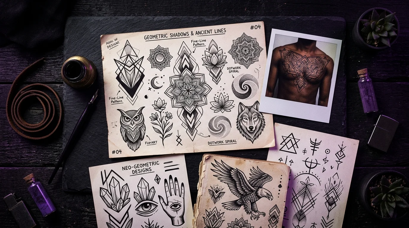
Fine Line
What it is: Hairline-thin strokes, delicate shading, minimal ink saturation. Botanicals, minimalist portraits, subtle geometric forms. The style that looks most like a pencil drawing.
The hidden cost: Fine line has the least structural buffer of any style. Less ink means faster UV degradation. A placement that gets regular sun exposure — forearms, wrists, hands — will show visible softening within five to eight years without consistent sun protection. Fine line tattoo aging covers the physics of this in detail: line weight equals ink volume, and less ink means less resilience.
Who it suits: Works best on protected placements (ribs, upper back, inner upper arm, hip) and on lighter-to-medium skin tones where fine contrast is visible. Artist selection matters more here than in almost any other style.
American Traditional (Old School)
What it is: Bold black outlines, limited color palette, iconic imagery — anchors, roses, eagles, daggers, hearts. The oldest codified tattoo style in the Western tradition.
The hidden cost: It’s one of the most polarizing styles on the spectrum — there’s limited middle ground between “this is timeless” and “this reads as dated.” Research shows traditional tattoos carry a 29% regret rate, tied highest of any style category — which likely reflects the fact that people often choose it without fully committing to its visual language.
Who it suits: Highly placement-agnostic because of the bold outlines — it holds on forearms, hands, legs, chest, anywhere. Works across all skin tones. If you love the visual language authentically, not ironically, this is one of the most structurally durable choices.
Neo-Traditional
What it is: Traditional’s outlines and structure, but looser — richer color palettes, more illustrative shading, a wider subject range than Old School’s classic iconography. Art Nouveau and Art Deco aesthetics run through the best examples. Think: still bold, but more contemporary. The full neo-traditional guide covers what the style actually is, how it ages, and what to look for in an artist.
The hidden cost: Color requires more maintenance. Rich multi-color work in neo-trad can fade unevenly over years, with lighter colors (yellows, pinks, pastels) losing saturation while the black outlines hold. The result can look patchy without periodic touch-ups.
Who it suits: Good for people who want traditional’s structural durability but broader creative range. Works on most placements. Better on medium and lighter skin tones for the color register to land as intended.
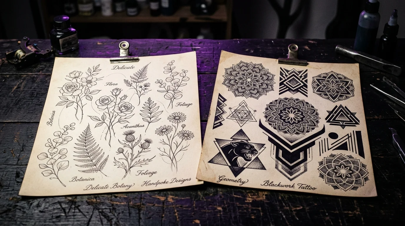
Blackwork
What it is: Ink-saturated black — bold fills, thick lines, high contrast geometry or organic forms. No color, no fine-line ambiguity. Includes tribal-inspired patterns, illustrative blackwork, and heavy-coverage designs.
The hidden cost: Dense blackwork is essentially irreversible — covering or removing it is significantly more complex than lighter styles. That’s not always a cost, but it’s a reality worth knowing going in.
Who it suits: Excellent across all skin tones — black ink saturates and reads clearly on deep, medium, and light skin alike. One of the most placement-agnostic styles because the bold saturation holds regardless of UV exposure. If you have any hesitation about the design, this is not the style to experiment in.
Geometric
What it is: Precise lines, repeating patterns, mathematical symmetry — mandalas, sacred geometry, grid-based abstractions. Often blackwork, sometimes incorporating dot-work for shading.
The hidden cost: Precision cuts both ways. A geometric tattoo where the lines are slightly off is more visually noticeable than in most organic styles — the eye goes to mathematical errors immediately. Artist selection is critical.
Who it suits: Flat body surfaces work best — the geometry distorts on curved areas like ribs or biceps if not designed to account for the contour. Works well across skin tones. Ages well because of the structural line weight.
Watercolor
What it is: Splashes of color that mimic the bleeding, layering, and translucency of actual watercolor paint. Often minimal or absent black outlines. Looks beautiful in reference photos.
The hidden cost: This is the style with the steepest aging curve. Without black outlines to anchor the design, the color bleeds and fades over time, leaving blurry shapes that can be difficult to interpret. A watercolor tattoo at year one and year twelve can look like two different tattoos. The artists doing this style well now know to incorporate subtle black anchors — the ones that don’t are setting clients up for disappointment.
Who it suits: Works on lighter skin tones where color contrast is visible. Needs a shaded placement to delay fading. Requires a specialist — general tattoo artists often cannot execute this style at a level that ages acceptably.
Realism
What it is: Photorealistic portraiture, nature studies, detailed three-dimensional rendering in black-and-gray or color. When done well, it looks like a photograph.
The hidden cost: More than any other style, realism lives or dies by the artist. A mediocre realistic portrait is immediately obvious. Research on amateur vs. professional tattoo quality found a 43% regret rate for amateur work vs. 19% for professional — and that gap is most visible in styles that demand technical precision. Research, find, and book the right artist. Do not compromise.
Who it suits: Larger canvases (chest, back, thigh, upper arm) where the detail can breathe. Works in black-and-gray across all skin tones; color realism is more skin-tone-sensitive. Sun protection is essential — UV degradation softens the fine gradations that make realism read correctly.
Cybersigilism
What it is: Ultra-fine blackwork linework with sharp angular geometry, symbolic forms drawn from digital aesthetics and occult sigil traditions. The first major style to emerge natively from internet culture. A full breakdown of the visual logic and placement requirements is here.
The hidden cost: The style demands specialist execution — general tattooers often can’t maintain the geometric precision the style requires. Finding the right artist takes more research than for most styles.
Who it suits: Flat, stable surfaces where the precision can hold. Forearm, chest, shin. Works on lighter-to-medium skin tones where the ultra-fine lines read clearly.
The Four Questions That Shrink the Field
Before aesthetics, run your idea through four constraints:
1. Where does it live? High-UV placements (forearms, wrists, hands, outer shoulders) punish fine line and watercolor harder than bold blackwork or traditional. Curved placements (ribs, collarbones, biceps) need designs built for the contour. High-movement spots (wrists, feet, fingers) stress any style — bold lines are more resilient than delicate ones.
2. What’s your skin tone? Fine line on deep skin tones can disappear if the artist doesn’t have specific experience. Watercolor washes don’t land on darker pigmentation the way they do in photos. Bold blackwork and traditional read clearly on every skin tone. If you have deeper skin and love fine line, the artist question is the most important one you’ll ask.
3. What does it look like at year ten? Every style ages. Bold traditional is at year ten what it was at year one, minus about 10% saturation. Fine line has softened but is still recognizable if properly placed and protected. Watercolor without outlines may have lost significant legibility. Build your style decision on the aged version, not the fresh one.
4. What’s the regret profile? Pew Research Center’s 2023 survey of 8,480 adults found that 24% of tattooed Americans regret at least one tattoo — and style-related regret clusters around choices made for trend reasons rather than personal fit. Run the honest test: would you still want this style if it weren’t currently popular? If yes, you’re in good shape.
The Body Question Nobody Asks Before Booking
Style guides cover what each style is. They rarely address whether a given style, at a given size, at a specific placement on your body, actually looks the way you need it to.
That’s the gap TattThat closes. Upload a photo, place the design you’re considering at your actual placement, and see how the style reads on your specific proportions before any appointment. A fine line botanical that looks perfect on someone else’s forearm might overwhelm yours. A bold geometric that seemed too intense in photos might be exactly right at the scale you can actually see.
Style anxiety — “will this suit me, or am I just copying what looked good on a stranger’s Instagram?” — is the specific fear this resolves. It’s not about whether you like the style. It’s about whether the style likes you back.
Each style has a dedicated guide if you want to go deeper: blackwork, watercolor, minimalist vs. traditional, and chrysanthemum and botanical fine line if floral work is where you’re landing.
See It on Your Skin Before You Commit
Upload a photo, pick a design, and see exactly how it'll look — in seconds. 2 free previews, no card required.
Try TattThat Free →