Will this still look the way it looks in the reference photo in five years?
That’s the question you haven’t quite asked out loud yet, but it’s the one that’s been running in the background since you started saving watercolor tattoo inspiration. The loose washes, the soft edges, the way the color seems to bloom rather than sit — it all looks incredible fresh. The question is what it looks like after a decade on skin.
The honest answer is: differently. Not necessarily worse — differently. Whether that difference is something you’ll love or regret depends on the design, the artist, and the choices you make before you book.
The direct answer: Watercolor tattoos fade faster than bold-outlined styles because color without structural anchors loses legibility as it softens over time. Light pastels (pale yellow, soft pink) show change most noticeably; deep saturated blues, purples, and reds hold much longer. A well-executed piece with a specialist who understands depth and contrast can remain beautiful for a decade or more. The key is understanding what “aged well” looks like for this specific style — and choosing your design accordingly.
What Makes Watercolor Tattoos Different Technically
Every tattoo fades. UV radiation breaks down pigment molecules in the dermis over time — research published in Photodermatology, Photoimmunology & Photomedicine confirms that UV radiation causes premature fading of colored tattoos. What varies by style is how that fading changes the design.
Traditional tattoos survive fading because of their structure. Bold black outlines — which fade more slowly than colored ink — maintain the design’s shape even as color washes soften inside them. The design remains legible because the structure persists.
Watercolor tattoos typically don’t have that structure. As iglatattoo.com’s aging guide explains, “black ink acts as a container for the color inside it” — without boundary lines, color in a watercolor tattoo softens and spreads gradually as skin regenerates. The wash that looked like precise brushstrokes in the fresh photo becomes more diffused over years. The piece doesn’t disappear; it transitions.
That transition can be beautiful — a watercolor that’s aged into softer, more blended washes can look genuinely painterly and atmospheric in a way that reads as intentional. Or it can look like a faded version of something that used to be more vivid. The difference is almost entirely in the design choices and artist execution.
The Honest Fading Timeline
Color matters enormously. Different pigments degrade at different rates under UV exposure and natural skin cell turnover:
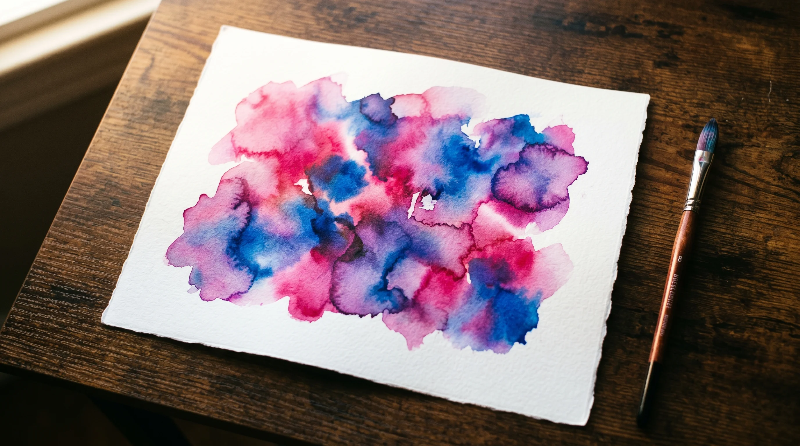
Fades fastest: Pale yellow, soft pink, lavender, light peach. These are the tones that show noticeable change within 3-5 years, even with good aftercare. A design that relies primarily on pastel washes will look visibly softer by the five-year mark.
Holds longer: Deep blue, rich purple, saturated red, forest green. These pigments retain more vibrancy at depth and show less change in the first decade. Designs built around these tones age significantly better than pastel-dominated pieces.
Holds longest: Black and dark grey. Any watercolor design that incorporates dark accents — even subtle linework or shaded elements — benefits from those elements remaining relatively stable as the color softens.
Ipsos data shows 92% of tattooed Americans are happy with their decision to get inked — but satisfaction research consistently shows that anticipating how a piece will age is part of what separates happy with the decision from wishing they’d known more going in. For watercolor, knowing the fading timeline before you book is the relevant piece of information.
When Watercolor Ages Beautifully (and When It Doesn’t)
Where watercolor thrives long-term:
Designs with intentional contrast anchors — a deeply saturated focal element surrounded by lighter washes, or subtle dark linework that doesn’t read as traditional outlining but provides structural depth. These pieces transition from vivid to atmospheric rather than from vivid to indistinct.
Protected placements. Inner upper arm, shoulder blade, upper thigh, ribcage — areas where UV exposure is naturally lower and friction is minimal. Watercolor on a shielded placement with consistent SPF looks dramatically better at ten years than the same piece on an outer forearm with no sun protection.
Artists who specialize specifically in watercolor and can show healed results at two, five, and ten years. The technique requires understanding how to pack color at the right depth — light enough to achieve the watercolor aesthetic, deep enough to hold. This is not a skill that transfers automatically from other styles.
Where watercolor struggles:
Sun-exposed placements without consistent SPF. Outer forearms, ankles, wrists — cumulative UV exposure is the primary accelerant of color degradation for any tattoo, and watercolor has the least buffer.
Pure pastel palettes with no contrast. A design that’s entirely pale washes with no saturation anchors is beautiful at one year and significantly softer at five. If your inspiration image is all soft lavender and pale peach, that’s the specific design to have the longevity conversation about before you book.
Hands, fingers, and feet. Constant friction from everyday movement accelerates fading in all tattoos; for watercolor, which is already more susceptible, these placements shorten the vivid period dramatically.
The Hybrid Approach Most Specialists Recommend
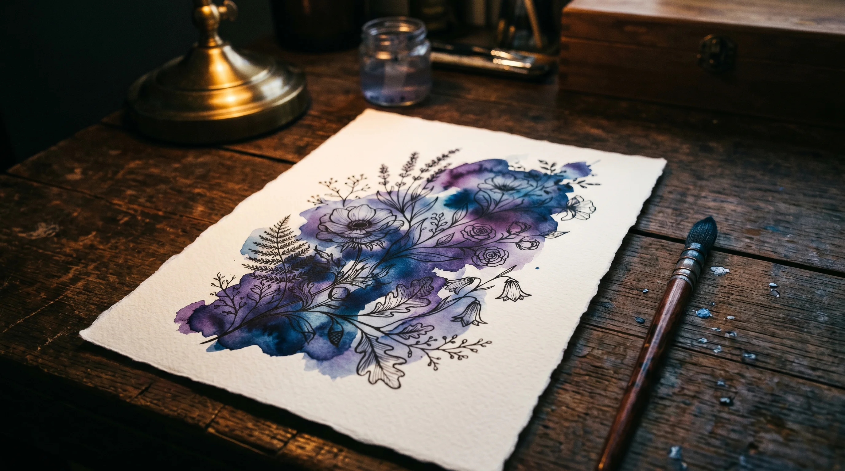
As Biomaser’s watercolor longevity guide puts it: “When you mix watercolor elements with strategic black outlines or darker base colors, the black lines or colors will act as supports and keep the design from getting blurry.” The most consistent advice is to incorporate subtle structural elements without making the piece look “outlined” in the traditional sense. This might be:
- Fine dark linework as part of the botanical or abstract elements (a stem, a geometric form) that provides contrast without creating hard borders
- Deeper saturation in focal elements, lighter washes at the edges
- Strategic use of black or dark grey as accent elements within the composition
The goal is a design that maintains legibility as the color softens over time — so the aged result looks like an intentional evolution rather than a faded version of something more vivid.
Before you finalize the design, ask your artist to show you healed examples of their watercolor work at three to five years. An artist who can show you their own work over time has made the feedback loop — and adjusted their technique accordingly.
Seeing the Color on Your Skin Before You Commit
Watercolor tattoos are one of the hardest styles to evaluate in advance. The vibrancy in the reference photo, on someone else’s skin, at their placement, tells you almost nothing about how the specific colors will read on your skin tone, at your scale, at your placement.
TattThat lets you upload a photo and apply your reference design to your actual body before any booking — so the “will these colors actually work on my skin” question gets a visual answer instead of a guess. For watercolor especially, where the palette is everything, seeing it on yourself first changes the conversation.
For more on style comparisons and what to look for in an artist for technically demanding work, the full style guide covers every major category with aging tradeoffs. And if you’re drawn to the watercolor aesthetic but concerned about longevity, the fine-line guide covers the adjacent style that uses similar restraint with better structural durability.
See It on Your Skin Before You Commit
Upload a photo, pick a design, and see exactly how it'll look — in seconds. 2 free previews, no card required.
Try TattThat Free →