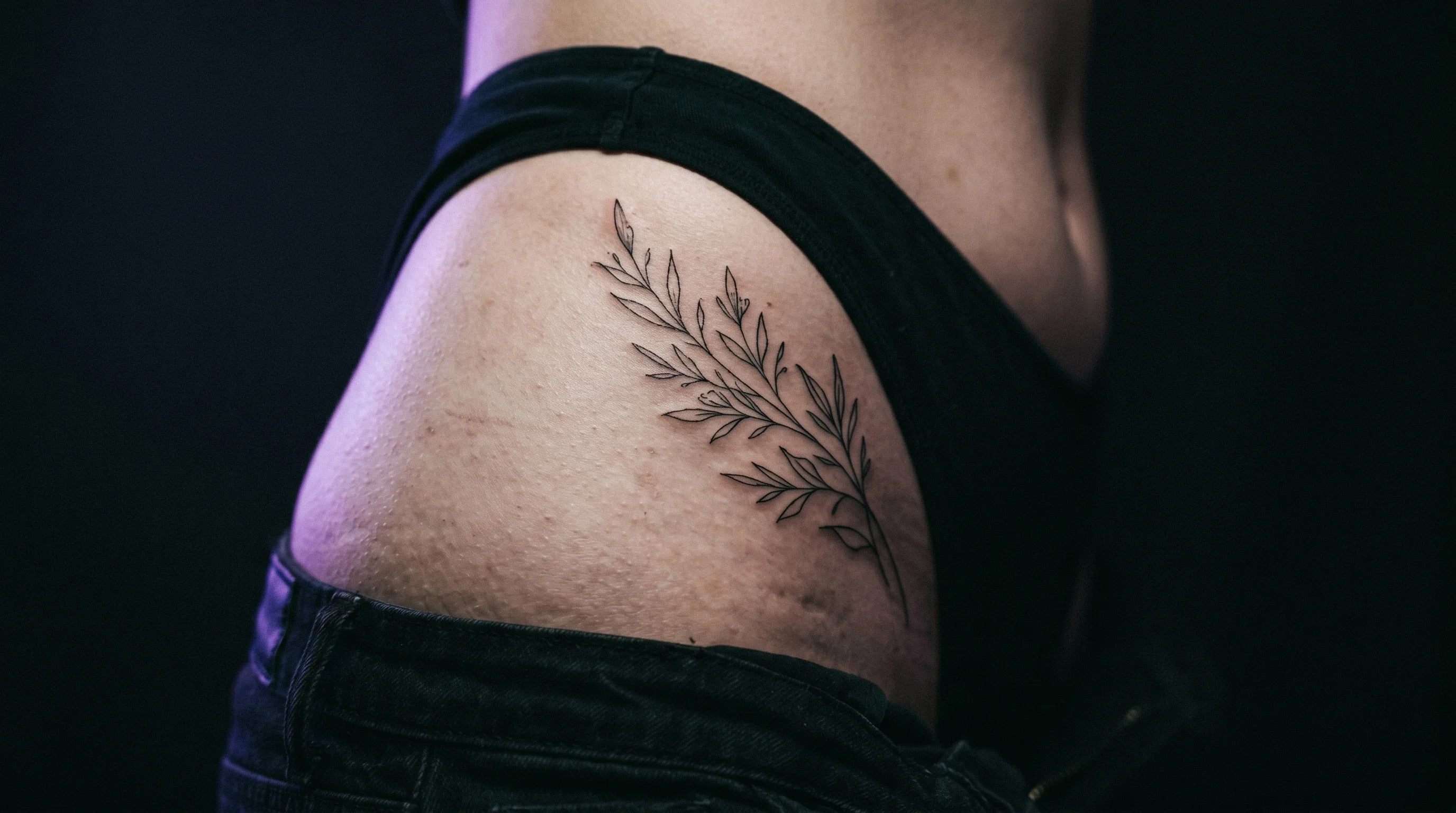
You’ve been circling the hip for weeks. You know you want it there. What you’re less sure about is whether you mean the hip bone at the top, the outer side of your body, or the lower curve just above your thigh — because the references you’ve saved all show something slightly different. They’re all called “hip tattoos.” They look nothing alike on different bodies.
That ambiguity isn’t a problem with your instincts. It’s a feature of the placement itself. The hip gives you three meaningfully different zones, each with its own canvas, pain profile, and visual logic. Most people treat the decision as one choice when it’s actually three. Narrowing down which hip you’re talking about is the first real decision.
The direct answer: Hip placement consistently ranks among the least-regretted tattoo locations. The reasons compound: the placement is naturally shielded from UV damage most of the year, it’s less publicly scrutinized than arm or wrist work, and the design decisions people make here tend to be more personal and deliberate. Done right — with the specific zone chosen intentionally — it’s one of the most reliable placements on the body.
The Hip Has Three Distinct Zones — and They Look Completely Different
Most placement guides treat “hip tattoo” as a single category. It isn’t.
The hip crest. This is the top curve of the pelvis — the bone that shows when you wear low-rise jeans or a bikini. Designs here follow the natural arc of the iliac crest, curving from the lower back around toward the front. The result, when done well, is striking: compositions that look like they belong to the body’s shape rather than sitting on it. The catch is pain — this is bony territory. The needle works with minimal fat cushioning, which produces a sharper, more radiating sensation than the outer hip. Most people who’ve had rib work find it comparable.
The outer hip. This is what most people mean when they say “hip tattoo” — the side of the body from roughly the waist to the upper thigh. It’s the most versatile zone. There’s real canvas here: flatter, wider, and with enough soft tissue that sessions tend to feel moderate rather than intense. This placement handles a range of design sizes and orientations, and it transitions naturally toward the thigh if you want to extend the piece later. Refinery29 notes that hip designs can range from something small that only appears in a swimsuit to dramatic compositions running from hip to thigh — the outer hip is the zone that supports both ends of that range.
The lower hip and hip dip. The hip dip — the inward curve between the hip bone and upper thigh — is the most concealed zone of the three. It sits below the typical waistband line and disappears under almost any clothing. It’s fleshier and typically more comfortable than the crest, with a canvas that works better for smaller, self-contained designs than large expansive pieces. This zone’s inward curve also makes sizing harder to judge without seeing the design placed directly on the body.
Picking among these three before you sit down matters. An artist who specializes in hip crest wrapping work may stencil the piece entirely differently than one who primarily does outer hip placements. Knowing which zone you’re committing to changes the design conversation.
Less Sun Means Hip Tattoos Stay Sharper, Longer
The hip spends most of its life under clothing. That’s not an inconvenience — it’s one of the main reasons hip tattoos hold up better than most people expect.
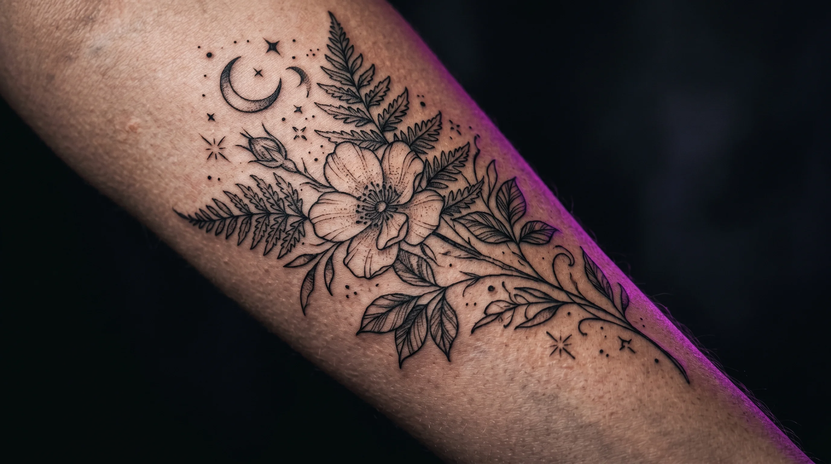
UV radiation is the primary driver of tattoo fading. The AAD recommends applying SPF 30+ to tattooed skin before sun exposure specifically because UV light degrades ink over time, with colored inks fading faster than black. The problem with the placements most people consider first — forearms, wrists, hands — is that they’re also the ones receiving the most cumulative UV exposure. Forearms see sun whenever you’re outside without sleeves. Wrists are exposed essentially all day, every day.
The hip is covered the vast majority of the time. It sees concentrated sun only when you’re at the beach or pool — exactly when you’re more likely to apply sunscreen. Black ink that’s been shielded from UV holds its contrast noticeably longer than the same ink on a frequently exposed placement. What reads as vibrancy in year ten often comes down to how much cumulative UV that skin has absorbed.
Hip skin is also relatively low-friction. Hands, wrists, and feet are in constant contact with surfaces, clothing seams, and each other — which mechanically disrupts ink over time and contributes to blurring at edges. The hip doesn’t have that problem. The combination of low UV and low friction is why fine line work on the outer hip tends to hold its edges better than equivalent work on a forearm or wrist.
One caveat: the lower hip and hip dip, especially in people whose waistbands sit directly on the tattoo, do see daily friction from clothing. For work in that zone, choosing placement that clears the typical waistband line by an inch or two makes a real difference in how the ink holds over time.
Regret Stays Low Here Because the Design Decision Is More Personal
The pattern in tattoo regret research is consistent: visible placements carry meaningfully higher regret rates. Face tattoos reach a 44.1% regret rate; upper extremity placements come in at 29.3%. The common thread is visibility — the more a tattoo is seen and evaluated by others daily, the more it accumulates social pressure that can shift how it feels over time.
The hip inverts that dynamic. You can’t see your hip tattoo at your desk, in a meeting, or commuting. Neither can anyone else. What remains is the relationship between you and the design — which tends to be more stable than the relationship between any tattoo and ambient public opinion. For more on how privacy shapes placement choices, the hidden tattoo placement guide covers which placements offer the most visibility control and why that tends to reduce long-term regret.
This also shapes what people choose to put there. Research on tattoo motivation consistently finds that personal meaning is the strongest predictor of long-term satisfaction — designs connected to specific experiences or private significance outlast designs chosen for external appeal. The hip, more than most visible placements, tends to attract those personal decisions: imagery that doesn’t need to be legible to strangers, designs that mark something the wearer carries privately. That deliberateness is part of why regret at this location stays low.
Sizing and Orientation: What Most People Get Wrong Before Booking

The hip’s curvature is both an asset and a variable. Designs that account for it read as intentional. Designs that fight it sit awkwardly on the canvas.
Vertical orientation works naturally here. Elongated designs — botanicals, snakes, abstract linear work, elongated geometric shapes — that run along the outer hip follow the body’s natural line. They extend toward the thigh cleanly if the piece grows later.
Wrapping designs use the hip’s three-dimensional shape rather than sitting flat against it. Compositions that wrap from the crest around toward the front or back are more complex projects, but they produce some of the most cohesive-looking hip work because the design integrates with the body rather than being applied to it.
Horizontal designs require more planning. A composition that looks level on a flat reference will arc slightly when placed on the hip’s curve. Your artist will compensate during the stencil phase — but knowing this going in lets you have the right conversation about orientation before the stencil goes down.
Sizing is where most people make their biggest mistake. The outer hip and hip crest offer a canvas significantly larger than most people visualize from a flat reference. A piece that reads well at A5 on paper often reads small on the actual body. Fine line work especially needs generous space — the tattoo size guide covers how design complexity sets the minimum viable size, a rule that matters even more on the hip where going too small compounds over years of skin movement.
The practical problem: the hip’s curvature makes all of this genuinely hard to judge without seeing the design on your actual body. You can’t hold a reference image to your own side and get an accurate read at the right scale. Before your consultation, use TattThat to upload a photo of whichever zone you’re considering — outer hip, crest, or lower hip — position your design at actual scale, and see how it reads. Whether the proportions feel right, whether the orientation follows the curve correctly, whether it’s sized for the canvas rather than a flat page: these are the questions that decide how good the tattoo looks on your body, and they’re much easier to answer when you’re looking at a preview rather than making them in the chair.
The full tattoo placement guide covers how the hip compares to other lower-body and hidden placements if you’re still weighing your options.
See It on Your Skin Before You Commit
Upload a photo, pick a design, and see exactly how it'll look — in seconds. 2 free previews, no card required.
Try TattThat Free →